How I fixed my blog's performance issues by writing a new Jekyll plugin: jekyll-skyhook
posted
💡 If you don't want to read the full story, you can check out the jekyll-skyhook plugin on GitHub here.
When I started writing this blog, I figured I could write my posts, submit my website to Google Search Console for indexing, and presto - my posts would start appearing in Google search results.
That way, people who encounter issues like I did with dark/light mode not working in Ubuntu 24.04 would be a search result away from finding my fix.
I guess I sort of forgot what it took to start a blog from zero, because I recently decided to check on my website's stats in Search Console, and I was surprised to see that Google has not been indexing my pages at all - most are marked as "Crawled - currently not indexed"!
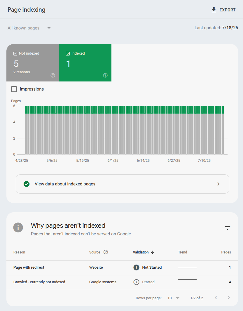
When I looked into why the heck that would be, I discovered that trying to determine the reason for a particular page not being indexed is pretty opaque. However, the general causes seem to be:
- Poor content
- Not enough backlinks
- Poor website performance
Well, if my content stinks there's not much I can do about that (except try harder I guess). And it's true I haven't submitted anything I've written yet to other sites like Reddit, Hacker News, etc. where people might share it and generate backlinks.
That leaves performance.
So, I opened up Google PageSpeed Insights, entered in one of my post URLs, and saw this:
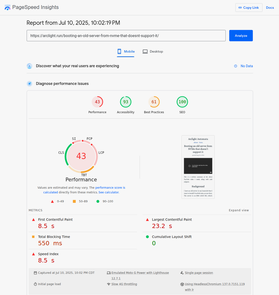
Wow! A big red 43 out of 100 - an abysmal failure. I was surprised at how bad the score was. I thought I kept my site pretty lean!
Surprisingly, some of the biggest dings I got on the report were for naively using Google products!
Google Fonts
First, loading a font using Google Fonts' "get embed code" button that uses their font CDN causes several issues:
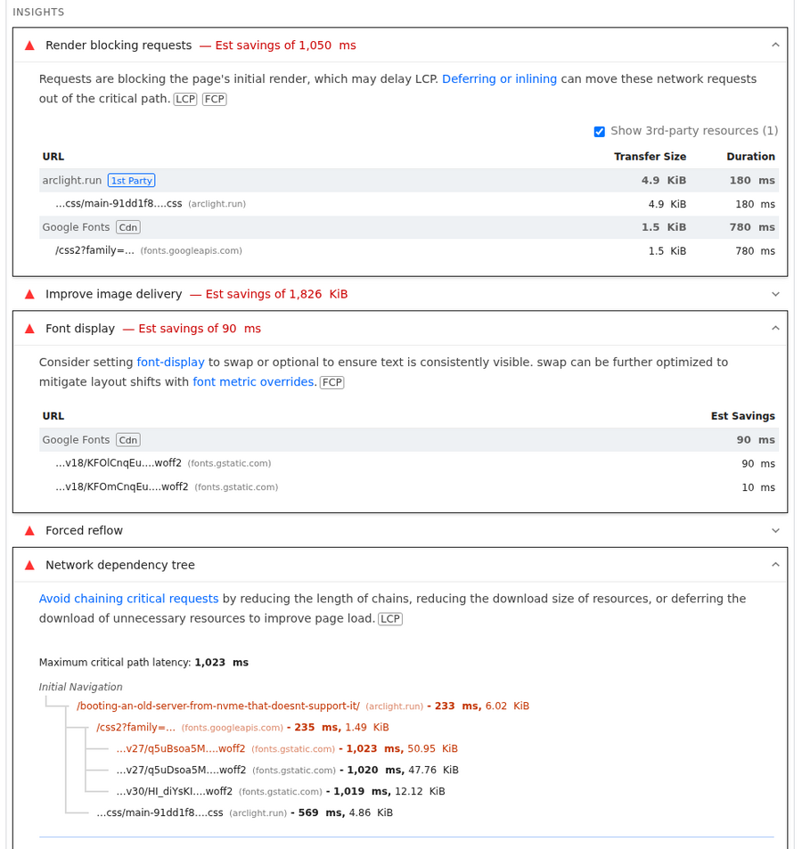
I fixed that by self-hosting the fonts. That involved manually downloading the .css and .woff2 files that Google Fonts was fetching, and embedding the .css directly into my site's CSS and changing it to reference my self-hosted .woff2 files. I also trimmed out all the non-Latin @font-faces which weren't being used.
There's a tool called google-webfonts-helper that I found after the fact which appears to do the same thing that I did manually that I could have used.
YouTube embed
Second, naively embedding YouTube videos using YouTube's own "share" button embed code is apparently an awful idea:

Google has a performance audit page that specifically recommends using third-party libraries rather than their own embed code (!) to fix this issue.
So I fixed this issue by using justinribeiro/lite-youtube from Google's list of recommended libraries, although I made a PR because it doesn't automatically load thumbnails for playlists like how YouTube's default embed does.
Image delivery
Of the remaining issues, most of them were related to poorly optimized images.
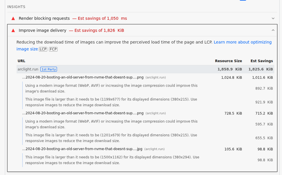
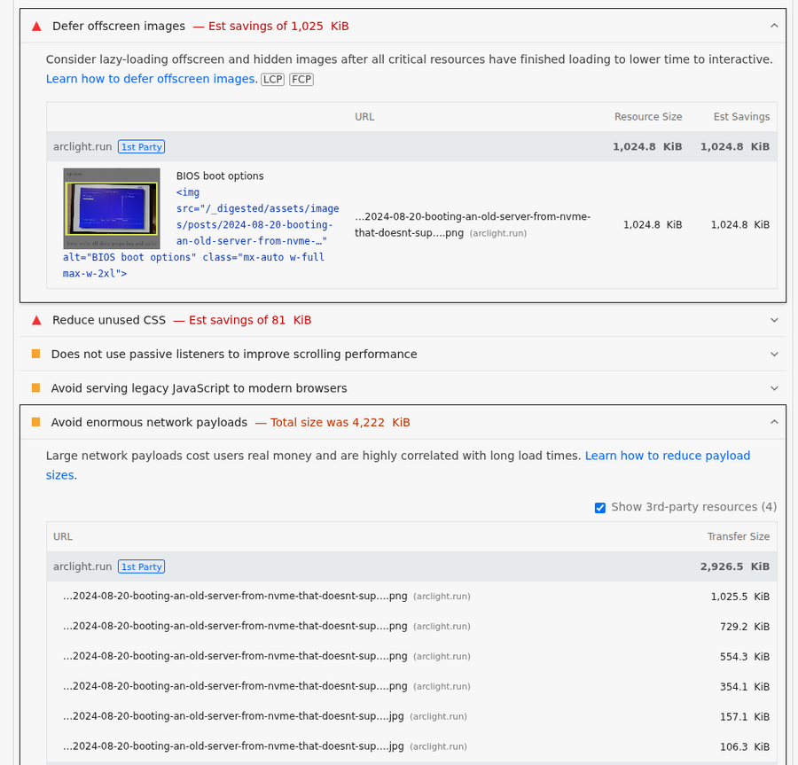
I had only been using single, high-resolution images that I referenced directly with <img> tags. No different images based on screen size, and no lazy loading. Yeah, that was kinda dumb.
An ideal solution would be to offer multiple image formats, including modern ones like AVIF and WebP, make them responsive by offering multiple sizes for different screen sizes (by using srcset), and lazy-loading them.
On an old Jekyll blog, I had used jekyll-assets to accomplish something like that, but I remember it being a pain to get started with. And at this point, the library seems to have been abandoned as it hasn't been updated in over 5 years.
More importantly, it uses Sprockets to implement an outdated, heavyweight Rails-style asset pipeline in Ruby. That old asset pipeline does not easily integrate with modern JavaScript build tools most codebases today use like esbuild, bun, or Tailwind's CLI build tool.
Nowadays, Rails has made the wise decision to embrace JavaScript/Node tools for processing assets, and dramatically shrink Ruby's role. Today, the lightweight Propshaft library is used instead, which basically just takes post-processed CSS and JS, stamps them with a hash digest (for cache friendliness), and rewrites CSS url() references to the new asset paths as needed. Modern JavaScript build tools are easily integrated into Rails apps with this approach.
I like the Propshaft approach quite a bit, but I don't see any comparable approaches in Jekyll-land. So, I wrote one myself.
My solution: jekyll-skyhook
I created the Jekyll plugin jekyll-skyhook to meet my needs. It has the following features:
- Image transformations - resize, format conversion (WebP, AVIF, etc.)
- Responsive images - automatic
srcsetgeneration - Cache-busting digests - fingerprinted asset URLs
- CSS
url()rewriting - automatic asset path updates - Development file watcher - automatic regeneration
- Manifest-based caching - avoid duplicate processing
By default it looks in the assets directory for assets to process (can be changed in _config.yml - see README).
For image transformations, we use the image_processing gem.
For regular assets that we only want to create a digest of, an {% asset %} tag is available, e.g.:
<link rel="stylesheet" href="{% asset assets/styles.css %}">
<script src="{% asset assets/app.js %}"></script>
For image transformations, there's a {% image_transform %} Liquid tag:
<!-- Resize image -->
{% image_transform assets/hero.jpg[width="400"] %}

<!-- Convert format -->
{% image_transform assets/hero.jpg[format="webp"] %}

<!-- Multiple transformations -->
{% image_transform assets/hero.jpg[width="800"][format="avif"] %}

<!-- Use in img tag -->
<img src="{% image_transform assets/hero.jpg[width="400"][format="webp"] %}"
     alt="Hero image" loading="lazy">
For responsive images, there's a {% srcset %} Liquid tag:
<!-- Generate multiple sizes in original format -->
{% srcset assets/hero.jpg 400 800 1200 %}

<!-- Generate multiple sizes in specific format -->
{% srcset assets/hero.jpg[format="webp"] 400 800 1200 %}
My blog setup
The way I do things in my blog is, I have a src/ directory where I have my unprocessed JavaScript and CSS stored in. I then have npm tasks like this defined in my package.json to process them and output them in the assets dir:
  "scripts": {
    "build:css": "tailwindcss -i ./src/main.css -o ./assets/css/main.css --minify",
    "watch:css": "tailwindcss -i ./src/main.css -o ./assets/css/main.css --watch",
    "build:js": "esbuild ./src/main.js --bundle --minify --outfile=./assets/js/main.js",
    "watch:js": "esbuild ./src/main.js --bundle --watch --outfile=./assets/js/main.js"
  },
Then in my site HTML I reference them with the {% asset %} tag:
<link rel="stylesheet" href="{% asset assets/css/main.css %}" media="print" onload="this.media='all'">
<script type="module" src="{% asset assets/js/main.js %}"></script>
For writing drafts in development, I run foreman with this Procfile:
build: npm run watch:css
js: npm run watch:js
serve: bundle exec jekyll serve -D -P 4001 --trace --watch
For building for deployment, my Makefile has tasks like this:
.PHONY: build clean serve serve-production deploy-staging deploy-production

build:
	npm run build:css
	npm run build:js
	bundle exec jekyll build --trace

clean:
	rm -rf _site
	rm -f assets/css/main.css
	rm -f assets/js/main.js
	rm -rf _digested
	rm -rf .jekyll-cache

serve: build
	bundle exec foreman start

serve-production: build
	bundle exec jekyll serve -P 4001

deploy-preview: clean build
	wrangler pages deploy _site --project-name=arclight-automata --branch=preview

deploy-production: clean build
	wrangler pages deploy _site --project-name=arclight-automata --branch=master
Finally, I store my images in assets/images directly and typically use this responsive-image helper include I wrote:
{% comment %}
Responsive image include for optimal performance across all devices.

Usage:
{% include responsive-image.html
   src="assets/images/posts/post-slug/image.jpg"
   alt="Description of the image"
   widths="400 672 900"
   sizes="(max-width: 640px) calc(100vw - 32px), (max-width: 710px) calc(100vw - 48px), (max-width: 899px) 640px, 672px"
   class="mx-auto w-full max-w-2xl" %}

Parameters:
- src: Image path (required)
- alt: Alt text (required)
- width: Image width in pixels (optional - auto-detected if not provided)
- height: Image height in pixels (optional - auto-detected if not provided)
- widths: Space-separated list of widths for srcset (default: "400 672 900")
- sizes: Sizes attribute for responsive images (default optimized for blog layout)
- class: CSS classes (default: "mx-auto w-full max-w-2xl")
- loading: Loading attribute (default: "lazy")
{% endcomment %}

{% assign widths = include.widths | default: "400 672 900" %}
{% assign sizes = include.sizes | default: "(max-width: 640px) calc(100vw - 32px), (max-width: 710px) calc(100vw - 48px), (max-width: 899px) 640px, 672px" %}
{% assign css_class = include.class | default: "mx-auto w-full max-w-2xl" %}
{% assign loading = include.loading | default: "lazy" %}
{% assign widths_array = widths | split: " " %}
{% assign largest_width = widths_array | last %}

{% comment %}Auto-construct post image path if only filename provided and we're in a post{% endcomment %}
{% unless include.src contains "/" %}
  {% if page.layout == "post" %}
    {% capture post_slug %}{{ page.path | split: '/' | last | replace: '.md', '' }}{% endcapture %}
    {% assign final_src = 'assets/images/posts/' | append: post_slug | append: '/' | append: include.src %}
  {% endif %}
{% else %}
  {% assign final_src = include.src %}
{% endunless %}

{% comment %}Get image dimensions automatically or use provided values{% endcomment %}
{% assign auto_width = final_src | image_width %}
{% assign auto_height = final_src | image_height %}
{% assign final_width = include.width | default: auto_width %}
{% assign final_height = include.height | default: auto_height %}

{% capture avif_srcset %}{% for width in widths_array %}{% image_transform {{ final_src }}[format="avif"][width="{{ width }}"] %} {{ width }}w{% unless forloop.last %}, {% endunless %}{% endfor %}{% endcapture %}
{% capture webp_srcset %}{% for width in widths_array %}{% image_transform {{ final_src }}[format="webp"][width="{{ width }}"] %} {{ width }}w{% unless forloop.last %}, {% endunless %}{% endfor %}{% endcapture %}
{% capture original_srcset %}{% for width in widths_array %}{% image_transform {{ final_src }}[width="{{ width }}"] %} {{ width }}w{% unless forloop.last %}, {% endunless %}{% endfor %}{% endcapture %}

<picture>
  <source
    type="image/avif"
    srcset="{{ avif_srcset }}"
    sizes="{{ sizes }}">

  <source
    type="image/webp"
    srcset="{{ webp_srcset }}"
    sizes="{{ sizes }}">

  <img
    src="{% image_transform {{ final_src }}[width="{{ largest_width }}"] %}"
    srcset="{{ original_srcset }}"
    alt="{{ include.alt }}"
    width="{{ final_width }}"
    height="{{ final_height }}"
    loading="{{ loading }}"
    class="{{ css_class }}">
</picture>
Which I call in my posts like:
{% include responsive-image.html
   src="settings.png"
   alt="Ubuntu settings" %}
which transforms the image into AVIF, WebP, and the original format, resizes them, and outputs responsive HTML like this:
<picture>
  <source type="image/avif" srcset="/_digested/assets/images/posts/2025-02-04-fixing-chrome-stuck-in-dark-mode-on-ubuntu-2404-with-regolith-i3/settings-formatavif-width400-e775ca2abe38ee3428829ad88d348e6b.avif 400w, /_digested/assets/images/posts/2025-02-04-fixing-chrome-stuck-in-dark-mode-on-ubuntu-2404-with-regolith-i3/settings-formatavif-width672-eeaf5541e25c6e5306815fc3db34e197.avif 672w, /_digested/assets/images/posts/2025-02-04-fixing-chrome-stuck-in-dark-mode-on-ubuntu-2404-with-regolith-i3/settings-formatavif-width900-4f26b438aa6e0471a377195b4f9027eb.avif 900w" sizes="(max-width: 640px) calc(100vw - 32px), (max-width: 710px) calc(100vw - 48px), (max-width: 899px) 640px, 672px">

  <source type="image/webp" srcset="/_digested/assets/images/posts/2025-02-04-fixing-chrome-stuck-in-dark-mode-on-ubuntu-2404-with-regolith-i3/settings-formatwebp-width400-7cfb0678cb0ac7ab51ea9c6b4ef060de.webp 400w, /_digested/assets/images/posts/2025-02-04-fixing-chrome-stuck-in-dark-mode-on-ubuntu-2404-with-regolith-i3/settings-formatwebp-width672-2f39ba847e34ed821604402bb37cac98.webp 672w, /_digested/assets/images/posts/2025-02-04-fixing-chrome-stuck-in-dark-mode-on-ubuntu-2404-with-regolith-i3/settings-formatwebp-width900-b9890313e6c7f1aede6a1d1391bbd08f.webp 900w" sizes="(max-width: 640px) calc(100vw - 32px), (max-width: 710px) calc(100vw - 48px), (max-width: 899px) 640px, 672px">

  <img src="/_digested/assets/images/posts/2025-02-04-fixing-chrome-stuck-in-dark-mode-on-ubuntu-2404-with-regolith-i3/settings-width900-0295066c055a667540c36da9f88dfbb1.png" srcset="/_digested/assets/images/posts/2025-02-04-fixing-chrome-stuck-in-dark-mode-on-ubuntu-2404-with-regolith-i3/settings-width400-ec8d7bddddbf0caafc5db3311973a2e2.png 400w, /_digested/assets/images/posts/2025-02-04-fixing-chrome-stuck-in-dark-mode-on-ubuntu-2404-with-regolith-i3/settings-width672-1a8ef86068ff4dab2fc573bb5cf66821.png 672w, /_digested/assets/images/posts/2025-02-04-fixing-chrome-stuck-in-dark-mode-on-ubuntu-2404-with-regolith-i3/settings-width900-0295066c055a667540c36da9f88dfbb1.png 900w" alt="Ubuntu settings" width="1199" height="979" loading="lazy" class="mx-auto w-full max-w-2xl">
</picture>
Updated result
After making as many of the changes as I could, and integrating my library, my PageSpeed score jumped way up to a green 99/100:
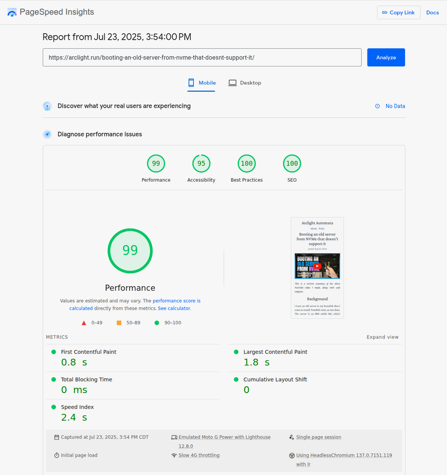
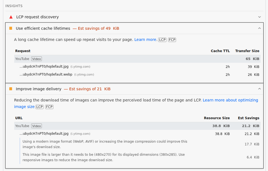
Amusingly, some of the only remaining issues are from external Google assets that I have no control over, like cache headers and unoptimized image formats on YouTube thumbnails:
Now all I need to do is focus on creating content and sharing it on social media…